APPROPRIATE COLOR SHADES IN THE INTERIOR. A CHOICE FOR WELLBEING
Taste, fashion trends, style, personality, the need to make the room visually wider - these are the starting points
for the color tones that we choose so that the interior matches the dreamed visions. But that
not everything! There are laws that do not age, and they apply to color tones in the interior , which are especially suitable
for a sweet sleep in the bedroom , to stimulate the appetite in the kitchen or
in the dining room , for coziness in the living room , for joy of life in the nursery .
Let's find out which colors work best in each of these rooms!
Should the chosen colors in the interior be light, darker and more saturated or bright accents
supplemented - the main thing is to feel in harmony in the premises. The effect of color can also be changed in the interior
accessories , which can give the room a completely different mood.
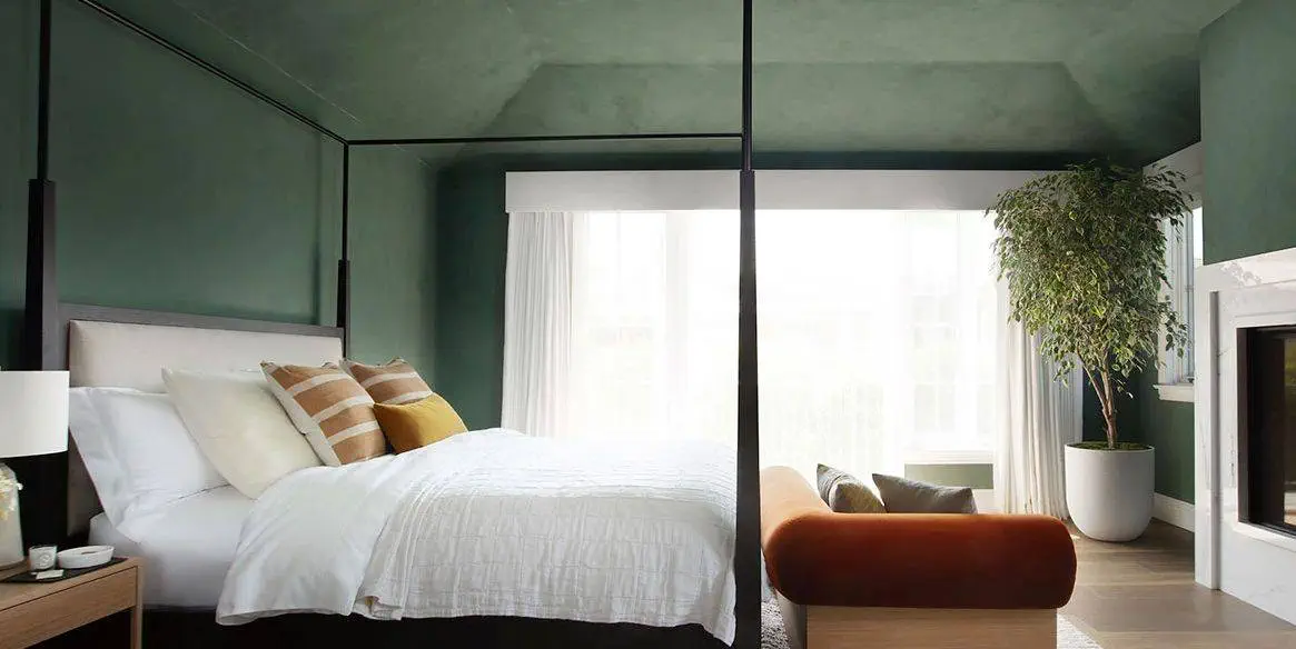
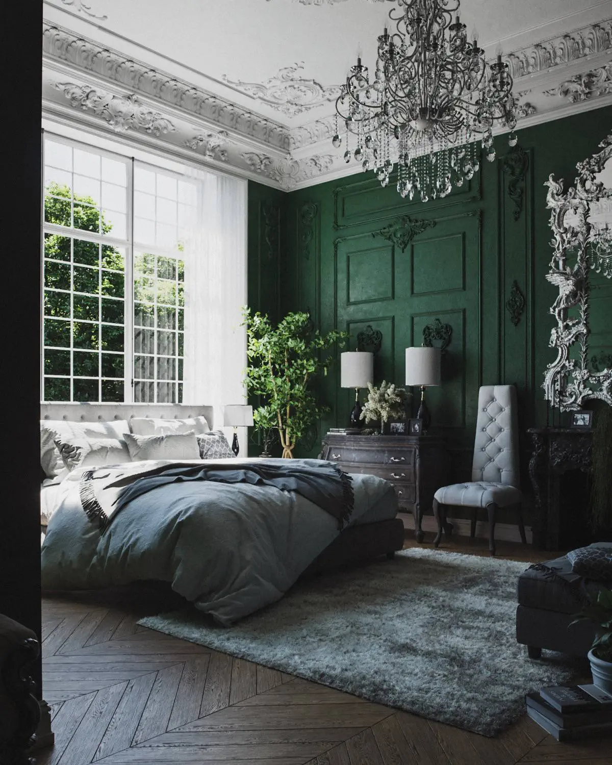
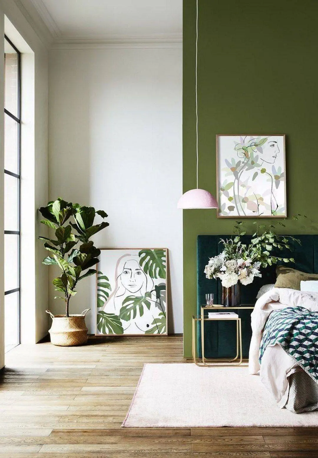
Bedroom
Scientists claim that the quality of sleep is affected by the colors that we see before falling asleep. Difficult
imagine the bedroom walls in an energetic fiery red shade, right? In turn, the quality of sleep affects how much
our next day will be productive and pleasant. The three most recommended tones in the bedroom , according to scientists,
neither white nor beige, but green , yellow and blue .
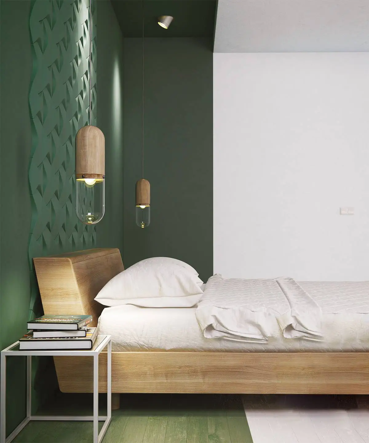
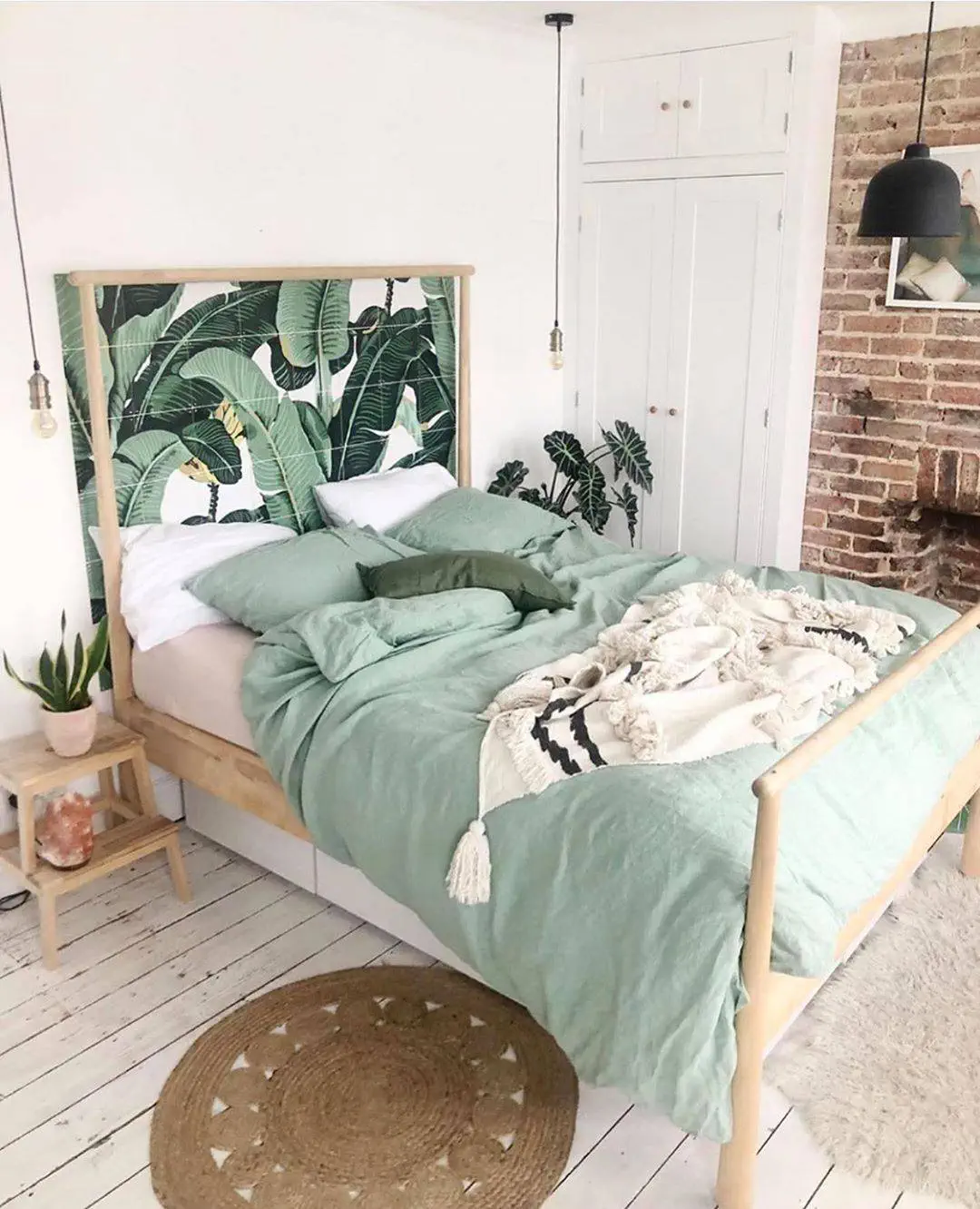
The green color is generally known for its calming effect. This is explained by the fact that green is in nature
the most common color. Green color has a positive effect on the nervous system, which helps to fall into a peaceful sleep and the next one
to wake up in the day full of energy.
Photo: PINTEREST
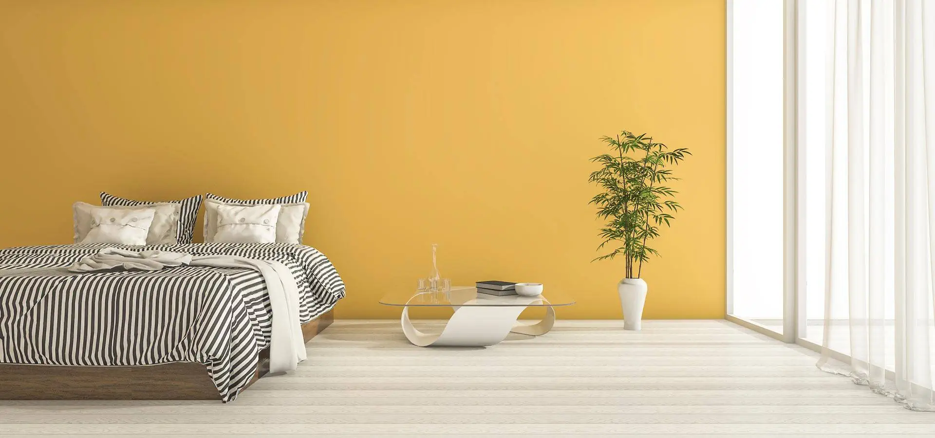
The muted yellow color calms, relaxes and frees you from anxious thoughts that tend to be
one of the sleep disorders. There is a spark of joy for the next day.
Photo: PINTEREST
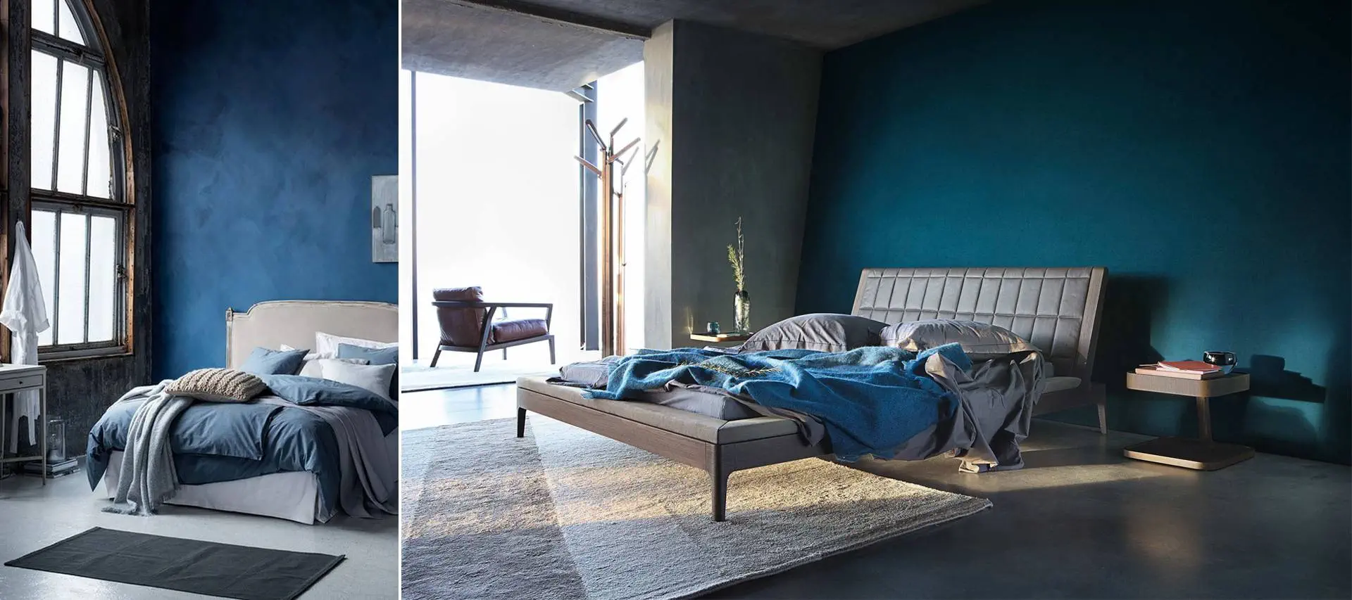
Blue tones are considered the most recommended in the bedroom. Blue tones are associated with spaciousness and peace
– the sea, the sky. Recommended color in the bedroom also for those who want to avoid staying up too late
for dinner, because blue color reduces appetite .
Photo: PINTEREST
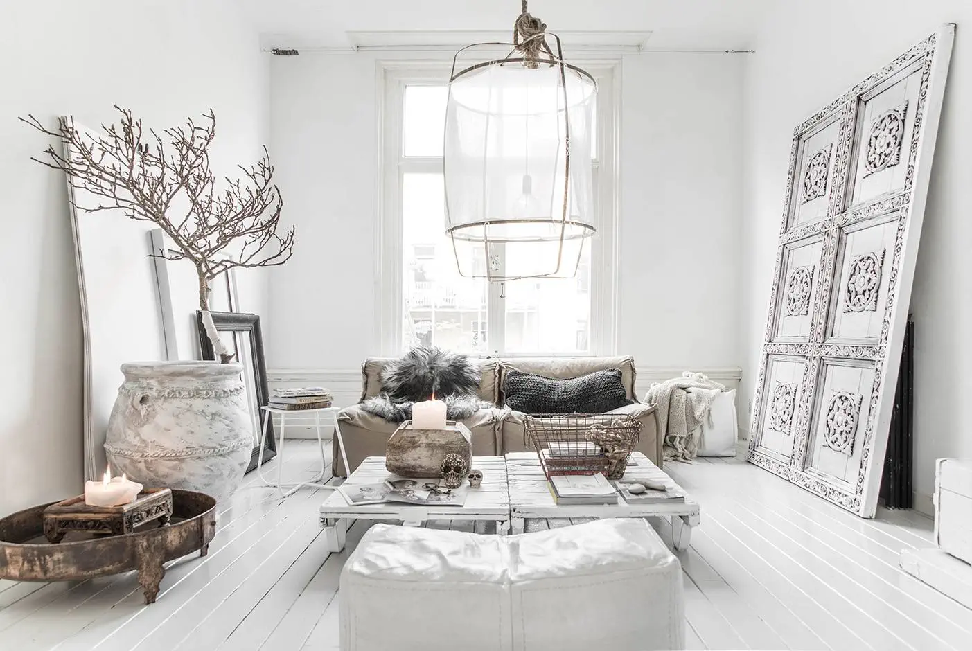
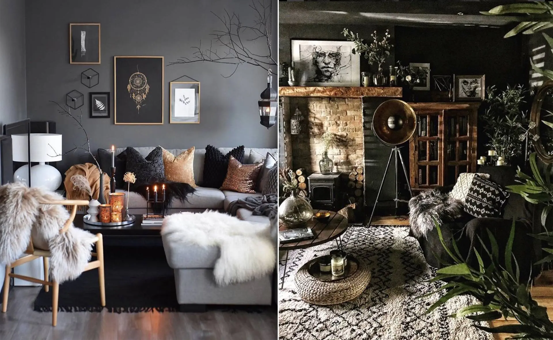
Living room
The living room is a room for everyone - for relaxation, family evenings, receiving guests. Comfort and
you can always achieve coziness by choosing neutral, balanced tones for the room, as well as dark tones that you can
choose for a separate area of the room so as not to create a heavy impression. Dark gray, brown or dark blue are correct
proportions will create additional coziness.
On the other hand, if you want to give an accent of energy and vitality, orange or yellow details or even
colored one of the parts of the room, like a fragment of a wall or a door.
An elegant accent without a gloomy undertone can be achieved by choosing a jewel tone for the accent, for example
emerald green.
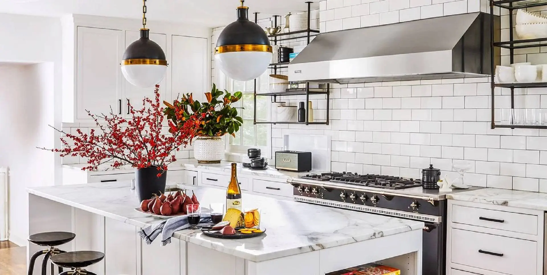
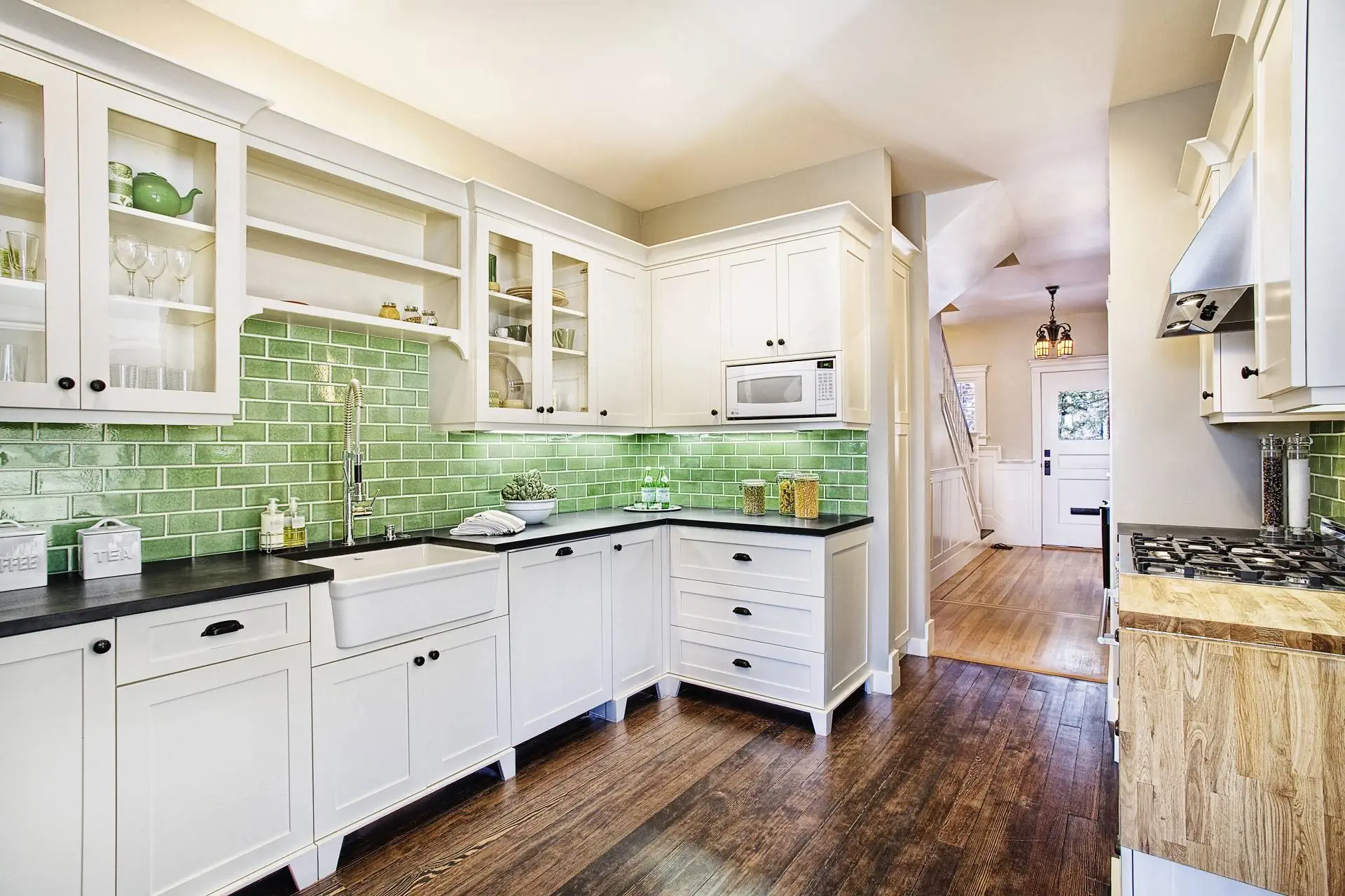
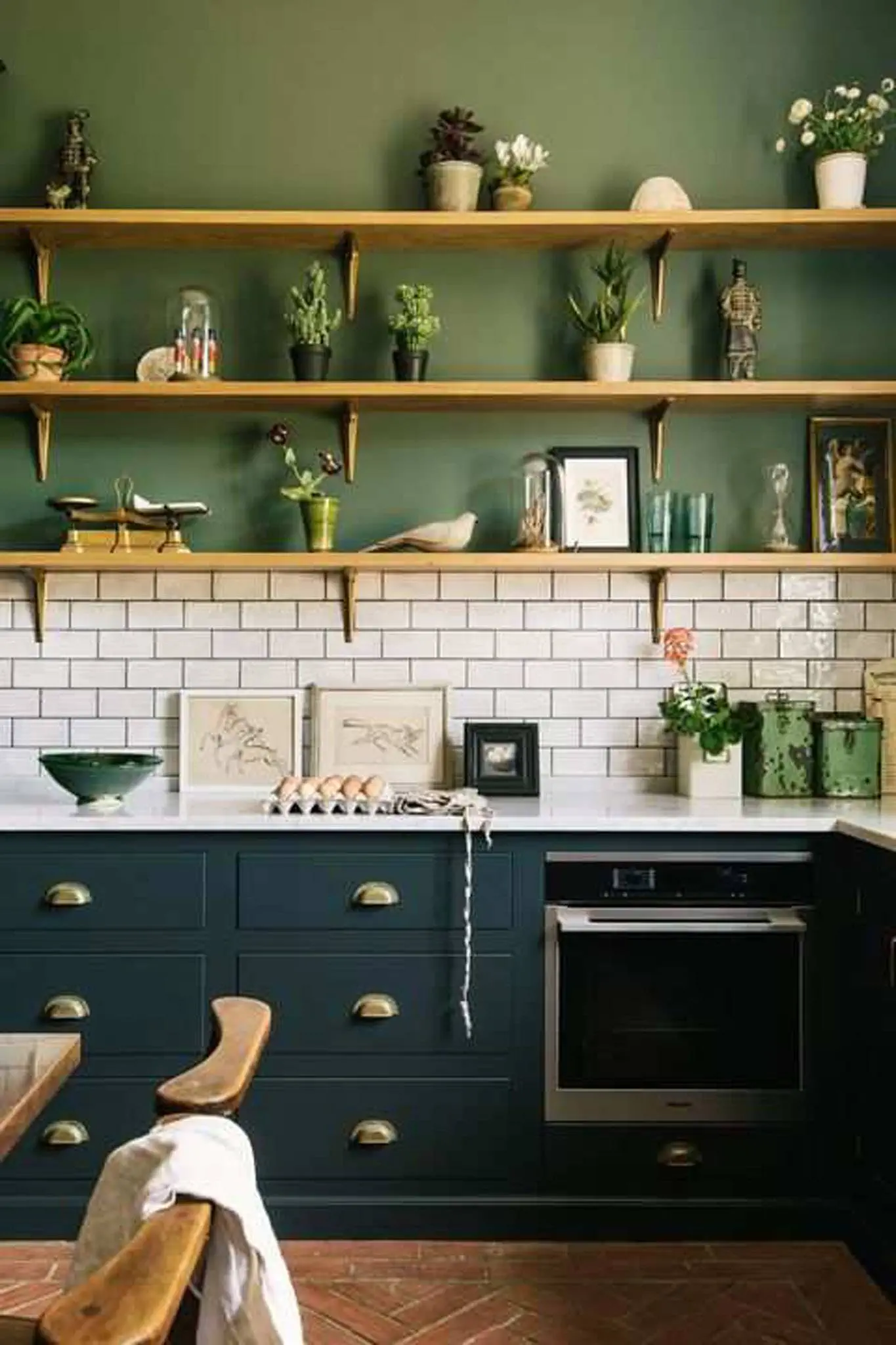
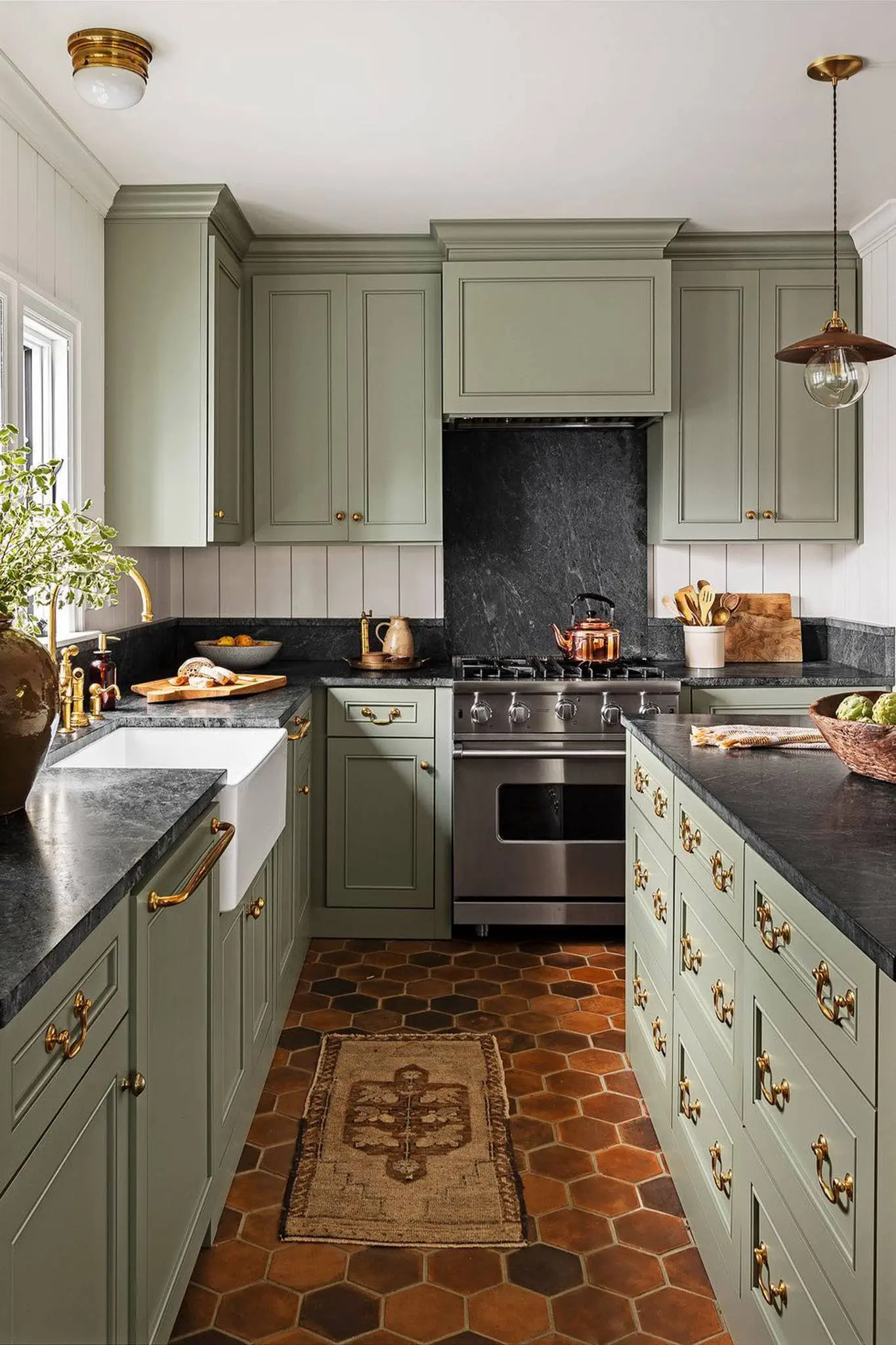
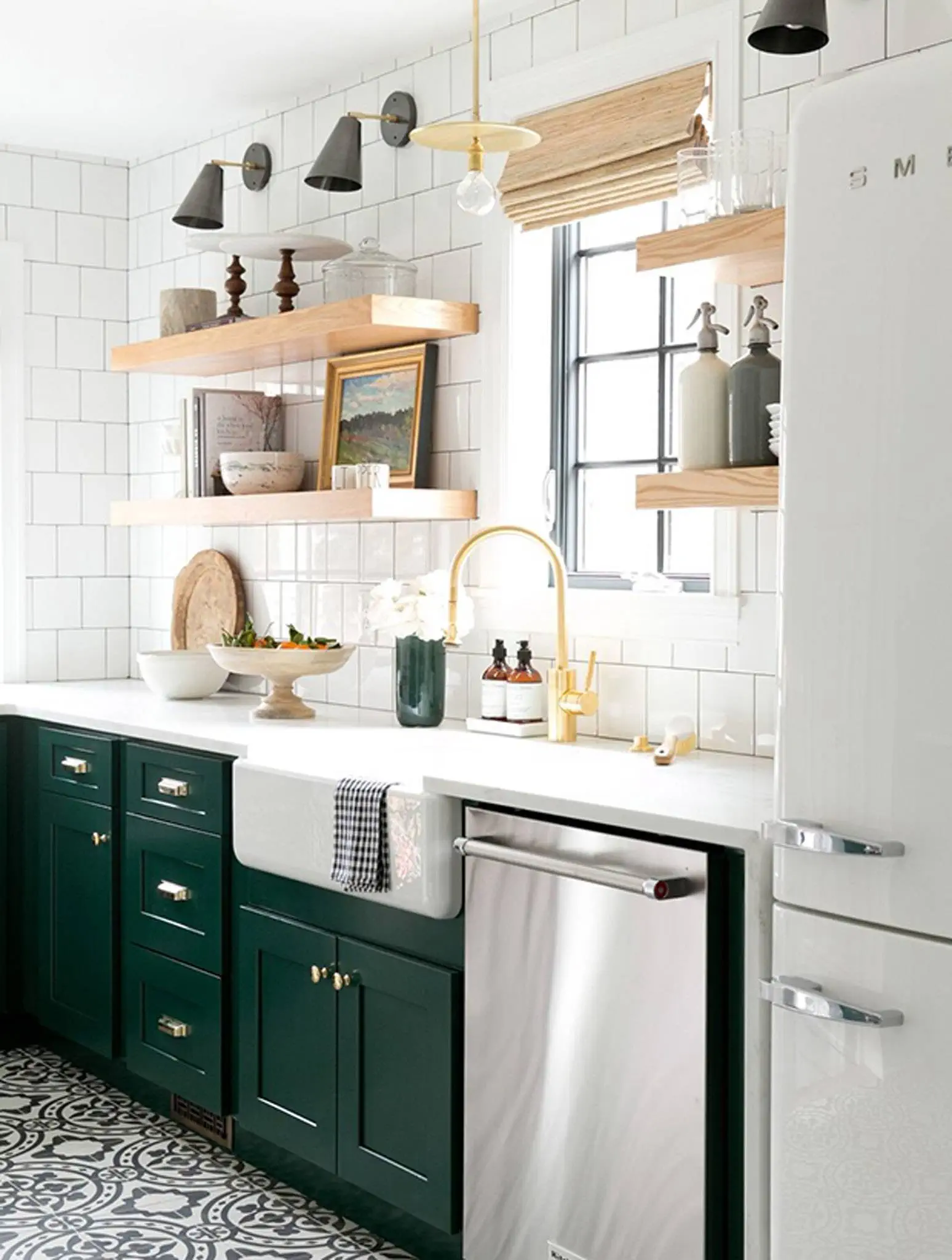
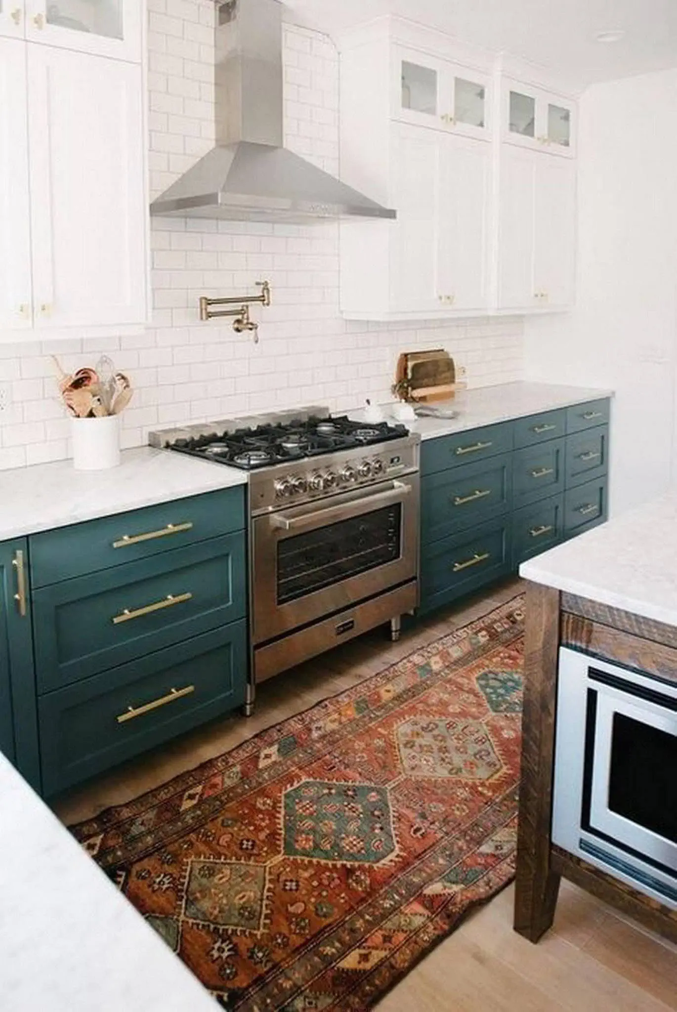
Kitchen
The kitchen or the dining room are those rooms where appetizing colors belong. A particularly grateful color
in the kitchen there is in white - it goes well with wooden floors, tables, shelves and looks extremely
tasteful.
No matter how perfectly the kitchen cabinets, shelves and other equipment for storing appliances and food are arranged
products, however, if you cook on a daily basis, this is a room full of all kinds of things - more than anywhere else.
Photo: PINTEREST
Therefore, again, neutral tones are the ideal choice, so as not to create too much variegation, which is tiring.
Food prepared on this background and natural materials
will stand out more in the interior. Light sand tones , brown will fit perfectly in the kitchen and create coziness
color in correct proportions, accents orange and red color , which stimulates the appetite,
but for fun - yellow accents.
If there is a desire to get used to healthier meals
cooking, try to introduce bright and lush green tones in the kitchen, which will help create the necessary mood.
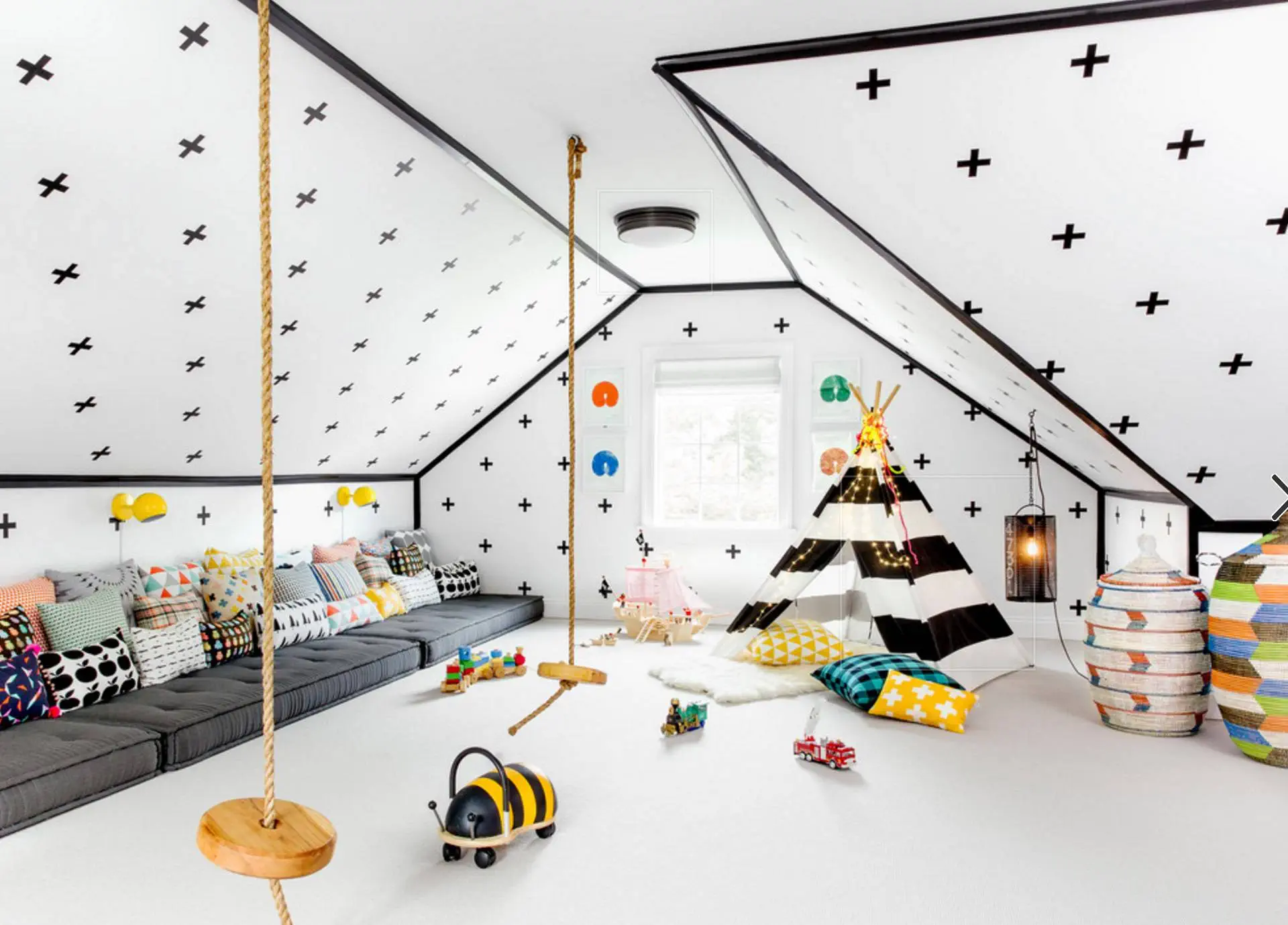
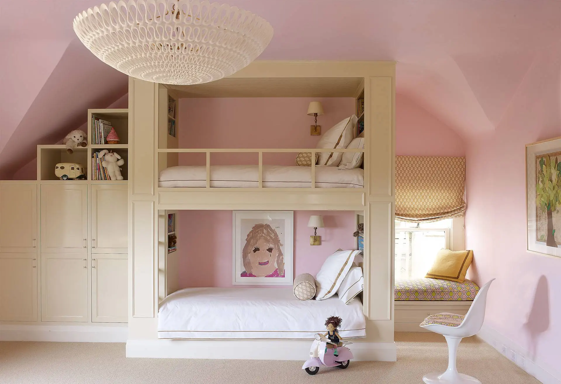
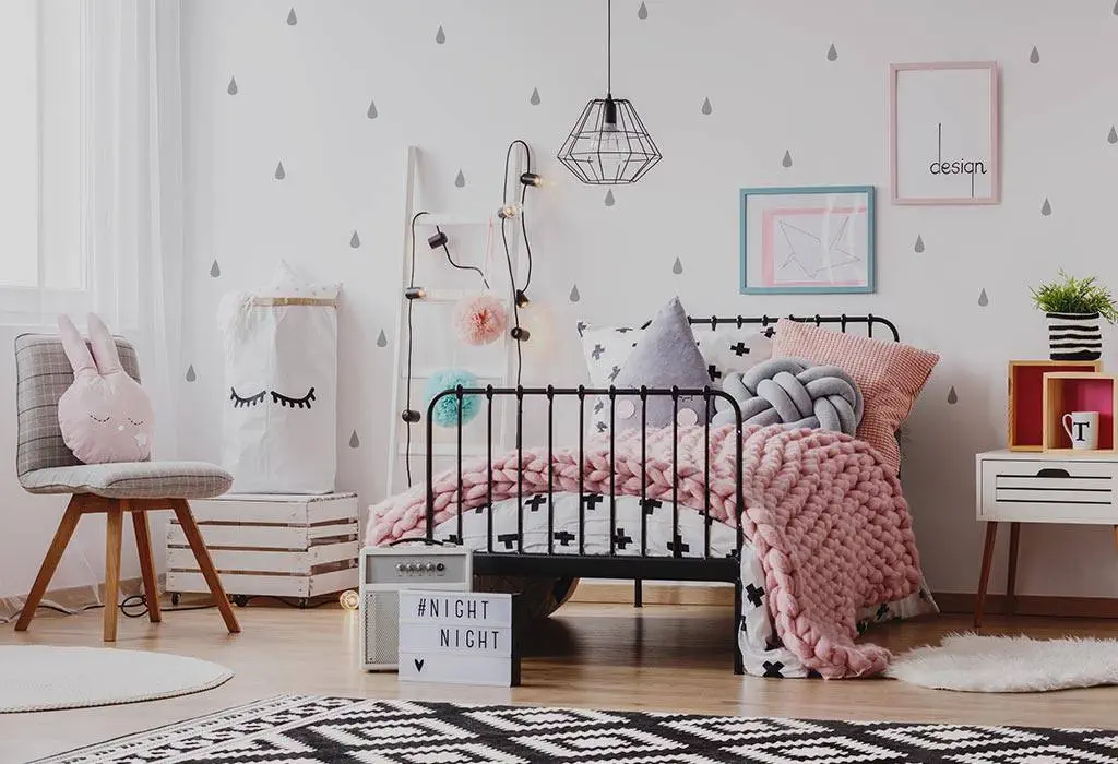
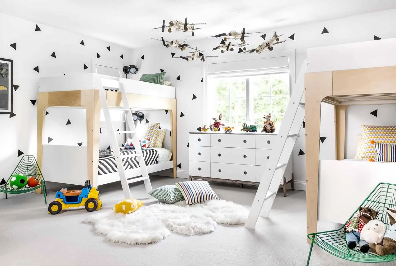
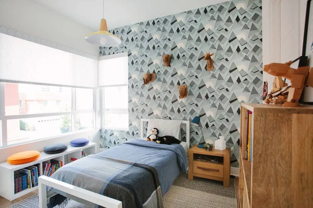
Children's room
The children's room is the one where you can indulge in an explosion of delightful colors. But here again it must be observed
principle - what is too much, what is too much, so that it does not happen that the bunch of colors makes the child feel restless. A good option
is to use white color as the base tone, which should be supplemented with different colors
for items and interior details. Arousing fantasy and joy of life will be enhanced by orange accents,
soft light yellow tones will help you concentrate and improve your mood on a not so happy day.
Photo: PINTEREST
It is safer to use green, which has a calming effect on both adults and children. If the child often nibbles
and curls, like blue interior , which, similar to green color, calms down.
It is interesting that the pink color , which is recommended to be used in the interior, is the favorite of so many girls' parents
in a reasonable amount, will also produce a calming effect.
This website uses cookies to improve the user experience and optimize its performance. By continuing to use this website, you agree to the use of cookies on this website.
Read more